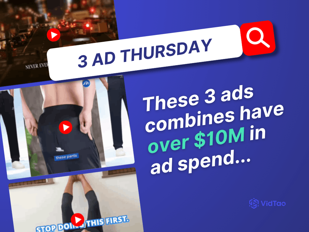
Welcome to, or welcome back to this week’s VidTao 3 Ad Thursday, where each week we’ll be diving into our VidTao ad spy tool to uncover 3 high-performing YouTube ads driving results!
This week we’ve got three high-performing YouTube ads for you to check out & model, including:
 Pants only for men over 65+ ad with nearly $2M in ad spend…
 Lymphatic drainage supplement ad with over $1.6M in ad spend…
 The Crash Connect ad with over $7M in ad spend!...
Ready to check the ads out?
Why your CFO doesn’t trust your
attribution tool 
Every attribution tool starts the same way.
One operator builds a system for their business…
then, it turns it into a product for everyone else.
Looks clean on the surface.
Until your business doesn’t fit the template.
Brat Vukovich (FOTW co-founder) breaks this down in this week’s post.
Under every attribution tool is a fixed data model:
- one structure for orders and customers
- one way to calculate revenue and LTV
- one template for how a business “should” behave
(That’s where the gaps start…)
- Subscriptions get miscounted.
- Bundles break the math.
- Multi-store data doesn’t connect.
So teams adjust.
And over time, they build a quiet layer of workarounds.
The dashboard isn’t the source of truth anymore.
The asterisks are.
That’s why finance rebuilds everything in Excel.
Brat is building Bratrax Lite to solve that problem: attribution and analytics for Shopify D2C brands where the data model is readable, adjustable, and built to match the business you actually run.
First 100 founding members lock in $79/month for life.
 Join the waitlist here: lite.bratrax.com

PS — The Dashboard is where Brat shares weekly notes on building Bratrax, buying media, and making sense of performance data - without the fluff.
PPS — Send this link to a friend who needs it: blog.bratrax.com
Let's dive right in and take a closer look at this week's YouTube ad standouts and discover what makes them so successful.
Pants only for men over 65+? (nearly 2M in ad spend!)
That’s right, that’s exactly how these pants are advertised…
And this ad has nearly $2M in ad spend!
Check it out:

We dissected it and picked out some of the elements this ad consists of:
 Opening Hook
"I gifted my husband these pants and now he wears them everywhere."
Deceptively simple. The wife-gifting frame does three things at once: establishes social proof, removes male purchase resistance (he didn't have to convince himself - she chose them), and implies the product is so good he reached for it repeatedly without being asked. "Everywhere" is the key word - it signals all-day wearability without making a single technical claim.
 Audience Declaration
"The most flattering everyday pants for men over 65."
Calling out "over 65" in the first breath is a bold targeting decision that pays off. This audience is massively underserved by apparel advertising - most brands pretend they don't exist. By naming them directly, Deniluxe earns instant relevance and trust with exactly the buyer most likely to convert. "Most flattering" is also a smart word choice - flattery-focused language resonates more with this demographic than performance or style language.
 Feature Demo Sequence
AirMax fabric, 10X ventilation, elastic waistband, 4-way stretch, deep zip pockets - each feature is paired with a close-up visual demonstration.
The fabric being pulled and stretched on camera is particularly effective: it makes the product's flexibility tangible without requiring the viewer to imagine it. The branded "AirMax Fabric Technology" label on screen elevates a commodity feature into something proprietary.
 Durability Promise
"No scratches, no wrinkles, no fading."
Three short negatives delivered in rapid succession. This is smart copywriting - "no" statements are often more persuasive than positive claims because they speak directly to feared outcomes rather than hoped-for benefits. For a buyer who's been burned by cheap pants that deteriorate after a few washes, this lands harder than "high quality fabric."
 Versatility Frame
"Perfect for every occasion from casual to active."
Expands the purchase justification - this isn't a niche product for one context, it's a wardrobe workhorse. For an older male buyer who wants simplicity and fewer decisions, "one pair that works everywhere" is a powerful value proposition.
 Risk Reversal + Variants
"Free return within 45 days. Comes in 7 colors and 4 inseams."
45 days is notably longer than the standard 30-day return window - the extra 15 days signals confidence in the product and generosity in the brand. Placed immediately before the CTA, it's the final objection kill. The color and inseam variety then reframes "get yours now" as a browsing invitation rather than a pressure close.
 CTA
CTA
"Get Yours Now" on screen alongside the product lineup in all color variants. Clean, direct, no countdown or false urgency needed - the feature stack and risk reversal have already done the persuasion work.
Takeaways
 Partner gifting POV is an underused hook in men's apparel - "I bought this for my husband" removes male purchase resistance and adds instant social proof in a single sentence.
 Age-specific targeting is a competitive advantage in overlooked demographics - calling out "men over 65" alienates nobody who matters and makes the actual buyer feel directly spoken to.
 Branded mechanisms elevate commodity features - "AirMax Fabric Technology" and "10X Ventilation" make breathability sound like an innovation worth paying for.
 Negative claims outperform positive ones for risk-averse buyers - "no wrinkles, no fading, no scratches" speaks to feared outcomes more powerfully than "high quality" ever could.
 Risk reversal belongs right before the CTA, not buried in the copy - placing "free return within 45 days" at the moment of decision maximizes its objection-killing effect.
 Variant depth signals brand seriousness - "7 colors and 4 inseams" tells the buyer this is a real product with real investment behind it, not a dropshipped one-size item.
Find more ads, relevant statistics and more about this advertiser inside VidTao:

~ update from our friends at Funnel of the Week ~
Listicle Leaderboard Q1 2026
Our friends at Funnel of the Week just released a new interactive dashboard showing the top Listicle Landing Pages of 2026 so far…
It's completely searchable & interactive, and Listicle Categories include DTC health, beauty, gadgets, financial, education, info, software and a whole lot more:

PLUS - see the ACTIVE STATIC ADS & VIDEO ADS running to these listicle landing pages right now
(So you can model the entire click -> presale journey for your own offers)
Want access? It's free.

Lymphatic drainage supplement ad with over $1.6M in ad spend
Our next ad pick is this lymphatic drainage supplement ad we stumbled upon - check it out:

This ad has over $1.6M in ad spend!
Here are some of the elements this ad consists of: Opening Hook
"Want to flush out swollen legs? Stop doing this first."
A two-part hook that does two separate jobs. The question identifies the sufferer and promises relief. "Stop doing this first" creates a pattern interrupt - the viewer expects to be told what to do, not what to stop. That subverted expectation buys the next 30 seconds of attention for free. The water balloon visual (filling, then releasing) makes the concept of fluid drainage visceral before a single word of explanation.
 The Hidden Knowledge Setup
"Most folks have heard about lymph nodes. But what no one talks about are these four lymph nodes right behind your knees."
Classic suppressed-knowledge framing, but applied to anatomy rather than conspiracy. The viewer already accepts that lymph nodes exist - so the claim that four specific ones are being ignored feels like a genuine gap in mainstream medical advice, not an invented narrative. The 3D animated lymph node visual at 0:10 adds medical legitimacy that stock doctor footage alone couldn't deliver.
 The Proprietary Mechanism
"Doctors call them popliteal nodes. But I call them O-Pumps."
This single line is the most sophisticated copywriting move in the entire ad. Acknowledging the real medical term first establishes credibility, then immediately replacing it with a branded nickname ("O-Pumps") creates ownership of the concept. From this point forward, the viewer thinks about their swelling problem in the ad's language - which means the ad's solution is the only one that fits.
 Fear Escalation
"The fluid gets stuck… skin so itchy and tight… hardens like concrete… some folks end up needing walkers… others end up on the operating table."
The escalation is methodical and deliberate. Each consequence is worse than the last, and each is described with enough vivid physical detail to feel real. "Hardens like concrete in your legs" is particularly effective - it's viscerally horrifying and completely unverifiable, which makes it impossible to dismiss. The viewer's imagination does the rest of the work.
 Existing Solution Destruction
"Compression socks squeeze fluid around for a few hours but don't unclog the O-Pumps. Water pills dehydrate you and could wreck your kidneys."
Each alternative is given a specific failure mechanism - not just "it doesn't work" but why it doesn't work and what damage it causes. This is critical: it doesn't just disqualify competitors, it makes the viewer feel that continuing with current treatments is actively harmful. By framing standard medical advice as dangerous, the ad positions its solution as the responsible choice.
 Authority Introduction
"Dr. John Gyro, top lymphatic specialist, helped over 54,000 people finally beat leg and foot swelling."
The "54,000 people" figure is doing enormous work here. It's specific enough to feel documented, large enough to suggest scale, and completely unverifiable. "Top lymphatic specialist" is a self-assigned title with no credential backing - but positioned after 90 seconds of medical-sounding education, the viewer's critical filters are already lowered.
 Three-Step Solution Frame
"First it dissolves… Second it repairs… Third it restores…"
The numbered sequence mimics clinical protocol language. Each step maps directly onto a fear established earlier in the ad: dissolving the clogs (addresses the concrete buildup), repairing the pumps (addresses the root cause), restoring drainage (addresses recurrence). The "like you're in your 30s again" line is the aspirational close - sells the identity transformation, not just symptom relief.
 Final Fear Push + CTA
"Up to 30% of people develop permanent nerve damage after these procedures. Don't let that happen to you."
The ad ends where the fear ladder began, but now the stakes are maximum. Nerve damage, lymph node transplants, struggling to put shoes on in the morning - all converging in the final 30 seconds. "Mornings are for enjoying your coffee, not struggling to squeeze into your shoes" is a beautifully specific lifestyle image that makes the abstract benefit (reduced swelling) feel emotionally concrete.
This advertiser has many other cool, high-spending ads, don’t miss out and check out these as well for some additional inspo:

Takeaways
Naming the mechanism is more powerful than describing the product - "O-Pumps" reframes a common problem in proprietary language, making the advertiser's solution the only one that fits the newly defined problem.
Acknowledging the real term before introducing the branded one builds credibility - "doctors call them popliteal nodes, but I call them O-Pumps" earns trust before taking ownership.
Destroy alternatives with specific failure mechanisms, not vague dismissals - "compression doesn't unclog the O-Pumps" is more persuasive than "compression doesn't really work" because it uses the ad's own framework against the competition.
The fear ladder works best when each rung is worse than the last - swelling → hardening → walkers → surgery → nerve damage is a masterclass in progressive fear escalation that keeps attention through the full 2:45 runtime.
Unverifiable specificity converts better than honest vagueness - "73%," "54,000 people," "30% nerve damage" feel more credible than "most," "thousands," and "many" even with zero sourcing.
End on a lifestyle image, not a product claim - "mornings are for enjoying your coffee, not struggling to squeeze into your shoes" closes on an emotional vision that a supplement percentage claim never could.
 "Spy" on 37 Million YouTube Ads
(and Landing Pages)!
Unlock proven strategies for success with the VidTao Premium YouTube Ad Library. Get instant access to your FREE VidTao trial today 
 Claim Your FREE VidTao Trial Now!
Take the guesswork out of YouTube ads – start scaling smarter.
The Crash Connect ad with over $7M in ad spend!
Last for today is an ad by the advertiser whose ads we mentioned a few times before… and here’s another amazing ad by them, check it out:

This as has over $7M estimated ad spend! Crazy, right?
Now, here are some of the elements that make this ad work so well:
Opening Hook
"Never ever sue the driver who crashed into you after a car accident."
One of the strongest pattern-interrupt hooks in this entire series. The word "never" combined with the most intuitive post-accident action (suing) creates instant cognitive dissonance. The viewer expects advice about how to sue - instead they're told not to. That gap demands resolution, which is exactly what the next 3:30 provides. The nighttime highway footage with emergency lights adds visceral urgency before a single word of copy lands.
 Audience Qualification + Expansion
"If you've been in a car accident within the past year, even if you were just a passenger…"
Smart dual move. The 12-month window creates a large but defined pool. "Even if you were just a passenger" is the real insight - it removes the assumption that only at-fault or primary drivers qualify, expanding reach to every occupant of every vehicle in any accident. Low-effort copy change, significant audience multiplier.
Existing Solution Destruction
"They either accept whatever small check insurance sends them, or they hire a lawyer upfront and prepare for a long, expensive legal battle. Both options leave you frustrated and underpaid."
Both obvious paths are eliminated in four sentences. Insurance = small check. Lawyer = expensive and slow. The two-option false dilemma is then resolved by the third path - which only this program offers. Structurally identical to the O-Pumps ad destroying compression socks and water pills, now applied to legal services.
 Authority by Visual Design
No named expert, no real spokesperson - just a voiceover over stock footage of crashes, money, distressed victims, and emergency vehicles. The authority here is entirely environmental: the badge logo, the "2025 program" language, and the government-adjacent channel name "The Crash Connect" do the credibility work that a fake doctor or AI whistleblower would do in other ads. The legal disclaimer visible at the bottom of the final frame quietly acknowledges it's a lead gen service - but by the time the viewer reaches it, the decision has already been made.
 The Proof Story
"Derrick decided to check if he qualified first. He received $130,000 in 42 days without suing anyone or paying legal fees upfront."
Textbook fabricated testimonial mechanics: common first name, specific dollar amount, specific timeline, specific contrast against the rejected alternative ($8,000 upfront lawyer fee). The "42 days" detail is particularly effective - round numbers like "six weeks" feel estimated, but "42 days" feels measured and documented.
Process Simplification
"Four basic multiple choice questions. No legal terminology. Nothing complicated. Takes roughly 30 seconds."
The ad spends more time making the qualification process feel effortless than it does explaining the actual service. This is intentional - the real product being sold is the click, not the settlement. Every word in this section is designed to remove the mental energy cost of engaging.
Money Visualization
"What would $80,000, $120,000, or even $150,000 do for you today? Clear out those medical bills. Get a reliable vehicle again. Stop living with financial anxiety."
Three specific dollar amounts followed by three specific use cases. The amounts escalate to anchor expectation high. The use cases are precisely chosen to mirror the most common post-accident financial stressors - medical debt, vehicle loss, income disruption. The viewer isn't imagining a windfall; they're imagining relief from specific pain they're already feeling.
 Urgency Stack
"These claims come with deadlines. Miss your window and that money disappears permanently… other people are already spending their settlement money and moving forward."
Three urgency levers fired in sequence: legal deadline (real, creates genuine pressure), permanent loss framing ("disappears permanently"), and social comparison FOMO ("other people are already moving on"). The final line - "you might be walking away from life-changing money" - reframes inaction as an active choice to lose, not simply a delay.
Takeaways
Contradict the obvious action in your hook - "never sue" to an accident victim is as powerful as "never take compression socks" to someone with swollen legs. Leading with the counterintuitive command stops the scroll cold.
Eliminate both obvious alternatives before introducing your solution - making insurance AND lawyers the enemy leaves the viewer with nowhere else to turn, which makes your third path feel like the only rational choice.
Audience expansion with a single qualifying line costs nothing and multiplies reach - "even if you were just a passenger" is five words that potentially double the addressable audience.
Government-adjacent branding builds authority without making verifiable claims - a badge logo, a year in the program name, and official-sounding language do the same credibility work as a fake expert, with less legal exposure.
Specificity in proof stories converts harder than social proof at scale - "$130,000 in 42 days" outperforms "thousands of satisfied clients" because it gives the brain something concrete to compare against.
Stack urgency mechanisms in layers, not all at once - deadline, permanent loss, and social FOMO land harder when sequenced than when delivered simultaneously, because each one reactivates pressure just as the previous one fades.
To finish off with, here’s a quick look at this advertiser’s landing page in use:

Want to brainstorm with us on new ways to scale your business with
YouTube Ads (and other performance video platforms)?
Join us for a free YouTube ad brainstorming session here:
That's all for this week! 
We hope this week’s selection of high-performing ads has sparked new ideas to test yourself!
Want more insights like these?
Stay tuned for next week’s VidTao 3 Ad Thursday, where we’ll continue breaking down winning strategies from the best YouTube ads in the game!
And btw… If you have questions about YouTube ads?
Go here to schedule a free chat with our friends at Inceptly. Inceptly is a top Direct Response video ad agency, specializing in high-performing YouTube ad creatives & media buying.
Have a great week!
PS - Go here to Claim Your Free Trial of VidTao Premium: Access 37 Million YouTube Ads & Their Landing Pages!
PPS - Are you spending $1k/day+ on Paid Ads?  Go here to set up a free YouTube Ad brainstorm chat.