

Want to see some YouTube Shorts ads that are scaling right now, using VidTao ad spy tool?
You’re in luck…
Because today is 2 Shorts Tuesday. Why YouTube Shorts ads?
Because YouTube Shorts ad inventory is only going to keep growing:
5 Reasons Why More Creators Are Choosing YouTube Shorts Instead of TikTok
#1 -  MORE MONEY
YouTube made it easier to earn money with YouTube Shorts in 2024 by letting creators take a cut of ad money from their Shorts—a better deal than TikTok’s confusing payment system.
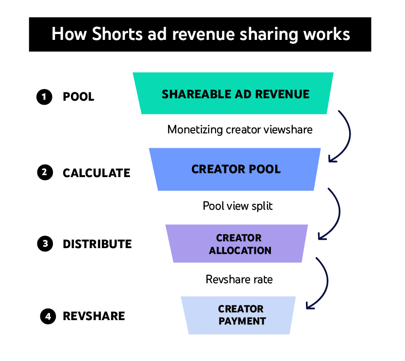
Image source: Google
This works for both short videos and regular YouTube content, making it safer for creators who want steady income.
#2 -  TikTok Ban Rumors/Reality
Rumors (and a quick reality) of a TikTok ban in the U.S. made many creators start posting on YouTube Shorts just in case. YouTube even let Shorts videos be 3 minutes long starting October 2024, copying TikTok’s style while giving creators more flexibility.
YouTube’s Big Advantages
#3 -  Built-in audience
Shorts get boosted by YouTube’s recommendations and trending lists, helping creators grow faster. TikTok doesn’t connect as well to other apps or longer videos.
#4 -  Different viewers
YouTube’s users are often older (25-34) vs. TikTok’s teen-heavy crowd, so creators can reach new fans.
#5 -  Creators Are Fed Up With TikTok
Many say TikTok’s rules change too often, and they’re tired of worrying about bans. YouTube feels more stable, especially with Google’s support for targeting the right audiences. The 3-minute Shorts also let them tell better stories without switching apps.
...And critically, most DTC & Direct Response advertisers are still under-leveraging YouTube Shorts as an ad placement.
(and the upside is huge)
So, what are some ways you can succeed with YouTube Shorts ads?
Let’s take a closer look at 2 YouTube Shorts ads doing well right now:
 Ad 1: Leaply (Lymphatic reset program ad)
This first ad opens on a man with glasses speaking on a conference stage, microphone in hand, panel of experts seated behind him.
He looks like the kind of person who gets flown in to explain things. The first line lands immediately:
"If you sit 8+ hours a day and wake up stiff every morning - the next 90 seconds will change your life."

Then he names the mechanism: your fascia is dehydrated and blocking your lymphatic flow. And then he does something most health ads never bother to do - he lists every symptom the viewer is already experiencing and tells them they're not different problems. They're one problem.
Chronic neck tension. Heavy legs. Swelling. Morning stiffness. Bloating. Constant exhaustion. "You don't have different problems. You have one."
The explanation that follows is concise and visual - a side-by-side graphic of tight fascia vs hydrated fascia appears on screen as he talks. The connective tissue wrapping every muscle and lymph vessel in your body has dried out and hardened from years of stress. It's compressing the vessels that drain fluid and inflammation. Nothing flows. Everything builds. That's why you feel like this.
Then the reversal: "And it's reversible."
Seven minutes a day with the lymphatic reset program. The results timeline is stacked in clean beats - one week, two weeks, one month - each with a specific physical change. The ad closes asking the viewer to take a 3-minute test to find out if their fascia is the root cause.
Why this ad works:
 "You don't have different problems. You have one" is the whole ad in a sentence. This is the single most powerful move in the script. The viewer has probably Googled each symptom separately, seen five different doctors, tried five different things. Being told there's one upstream cause - and that it has a name - is genuinely relieving. It reframes confusion into clarity, and clarity into desire for the solution.
 The conference stage setting does credibility work without claiming credentials. He's not introduced as a doctor. No title card. But a bald man in glasses speaking from a lit stage with a panel behind him reads as authoritative without needing to prove it. The visual context transfers trust faster than any bio line would.
 The fascia graphic mid-speech is a proof insert that makes the invisible visible. Tight fascia vs hydrated fascia - shown as a texture comparison in the bottom corner of the frame while he talks. You can see what dried-out connective tissue looks like vs healthy tissue. The mechanism stops being abstract. This is the same technique the Everyday Dose ad used with the ORAC chart - keep talking, drop the visual, let both channels work simultaneously.
 The one week / two weeks / one month results ladder is paced for belief. "In one week, the holding begins to soften. Stiffness lifts. Shoulders drop." Each stage is specific and physical, not vague and emotional. The viewer can picture each one. And because the timeline is realistic rather than dramatic, it doesn't trigger skepticism - it triggers imagination.
 "Take the 3-minute test" is a smarter CTA than "download the app." It lowers the commitment threshold to almost nothing while still moving the viewer into the funnel. The test also implies personalization - your result, your body, your fascia score - which is more compelling than a generic product page.
Here’s a quick look at this advertiser’s quiz-type landing page in use as well:

Creative beats to swipe:
- Open with a precise symptom-based hook aimed at a specific daily behavior (sitting 8+ hours).
- List every symptom your audience experiences - then collapse them into one root cause.
- Name the mechanism with a visual. Make the invisible thing visible on screen.
- Deliver the reversal cleanly: "and it's reversible." Short sentence. Full stop.
- Stack a results timeline in physical, specific language - not emotions, sensations.
- Close with a low-commitment diagnostic CTA ("take the test") rather than a purchase ask.
~ update from our friends at Funnel of the Week ~
Listicle Leaderboard Q1 2026
Our friends at Funnel of the Week just released a new interactive dashboard showing the top Listicle Landing Pages of 2026 so far…
It's completely searchable & interactive, and Listicle Categories include DTC health, beauty, gadgets, financial, education, info, software and a whole lot more:

PLUS - see the ACTIVE STATIC ADS & VIDEO ADS running to these listicle landing pages right now
(So you can model the entire click -> presale journey for your own offers)
Want access? It's free.

 Ad 2: RiseGuide (Articulation/Charisma Course)
This next ad opens with a woman looking directly into the camera, exasperated, and says: "I'm begging you. Stop saying 'I'm fine, thank you.'"

Then she crosses it out on screen - a red strikethrough over "I'm fine, thank you" - and replaces it with "Nice to see you."
From there the format shifts into something closer to a rapid-fire interview compilation. Multiple settings: a TED-style stage, an intimate panel conversation, a podcast studio. Multiple presenters. All rotating through what feels like a single extended conversation - questions and answers firing at pace, each one landing a new objection or a new proof point.
The through-line is a 47-year-old who does 9 minutes of articulation training a day. His boss now asks him for advice. He doesn't recognize himself. The "expert" in the ad tells him - and by extension the viewer - that by the end of the month he won't recognize himself either.
The objections come fast: what if my mind goes blank mid-presentation? Isn't reading books better? What if I'm over 40? Each one gets a clean dismissal. "Reading only keeps you busy. It doesn't train real-time responses." The closer is a full course curriculum shown on screen - 15 lessons, "Unlock Your Charisma" - before cutting to a black screen: START BUILDING YOUR CHARISMA NOW.
Why this ad works:
 "I'm begging you. Stop saying I'm fine, thank you" opens with shared embarrassment. The viewer knows exactly what she's talking about. That filler phrase - the social autopilot response - is something nearly everyone recognizes in themselves and quietly cringes at. Opening with a behaviour the viewer already dislikes about themselves is a faster scroll-stop than any stat or claim. It's not a problem being introduced. It's a mirror being held up.
 The multi-setting, multi-presenter format creates the feel of a documentary. One presenter alone for 90 seconds risks feeling like a pitch. Three presenters across a TED stage, a panel, and a podcast studio feel like consensus - like multiple credible people are independently arriving at the same conclusion. The production cost is low. The authority transfer is high.
 "Professionals over 40 with untrained communication skills" is an audience filter that flatters while it targets. Calling someone's communication skills "untrained" could feel insulting - but in context it's reframing. It's not that they're bad at communicating. It's that they were never taught. The blame lands on the gap in their education, not on them. Same move Promova made with "it's not your fault." It works every time because it's true and most people already feel it.
 The objection-handling format builds trust through speed. Each objection gets one or two sentences maximum. No meandering. No over-explanation. The brisk pacing signals confidence - someone who answers fast doesn't feel like they're hiding anything. By the time the sixth objection lands and gets dismissed cleanly, the viewer's internal resistance has been worn down without them noticing.
 Showing the full course curriculum on screen is a commitment device. Fifteen lessons, each with a title and a runtime. It looks like something you'd find inside a platform you've already paid for. The specificity (Lesson 8: "Give Tough Feedback Fast - 17 min", Lesson 11: "Interrupt Smoothly - 10 min") signals that this is a real, built-out product - not a vague program with a nice name. Specifics sell.
Creative beats to swipe:
- Open by naming a specific behaviour the viewer does but dislikes - not a problem, a habit.
- Cross it out visually on screen and replace it with the better version. Make the swap visible.
- Rotate settings and faces to build the feel of consensus rather than a single pitch.
- Run a rapid objection-handling sequence - short questions, shorter answers, keep the pace high.
- Show the product curriculum or content list on screen. Specificity of what's inside closes skeptics.
- End with a direct, confident identity CTA: not "learn more" but "start building your charisma now."
This advertiser has many other cool ads to model after, don’t miss out on some additional inspo:

 "Spy" on 42M YouTube Ads
(plus Landing Pages)!
Unlock proven strategies for success with the VidTao Premium YouTube Ad Library. Get instant access to your FREE VidTao trial today 
 Claim Your FREE VidTao Trial Now!
Take the guesswork out of YouTube ads – start scaling smarter.
That's all for this week! 
We hope this week’s selection of high-performing YouTube Shorts ads has sparked new ideas to test yourself!
Want more insights like these?
Stay tuned for next week’s VidTao 2 Shorts Tuesday…
…where we’ll continue breaking down winning YouTube Shorts Ads you can break down + model for your own creatives & campaigns.
And btw… If you have questions about YouTube ads or YouTube Shorts ads in particular?
Go here to schedule a free chat with our friends at Inceptly. Inceptly is a top Direct Response video ad agency, specializing in high-performing YouTube ad creatives & media buying.
Have a great week!
PS - Go here to Claim Your Free Trial of VidTao Premium: Access 40 Million YouTube Ads & Their Landing Pages!
PPS - Are you spending $1k/day+ on Paid Ads?  Go here to set up a free YouTube Ad brainstorm chat.