

Want to see some YouTube Shorts ads that are scaling right now, using VidTao ad spy tool?
You’re in luck…
Because today is 2 Shorts Tuesday. Why YouTube Shorts ads?
Because YouTube Shorts ad inventory is only going to keep growing:
5 Reasons Why More Creators Are Choosing YouTube Shorts Instead of TikTok
#1 -  MORE MONEY
YouTube made it easier to earn money with YouTube Shorts in 2024 by letting creators take a cut of ad money from their Shorts—a better deal than TikTok’s confusing payment system.
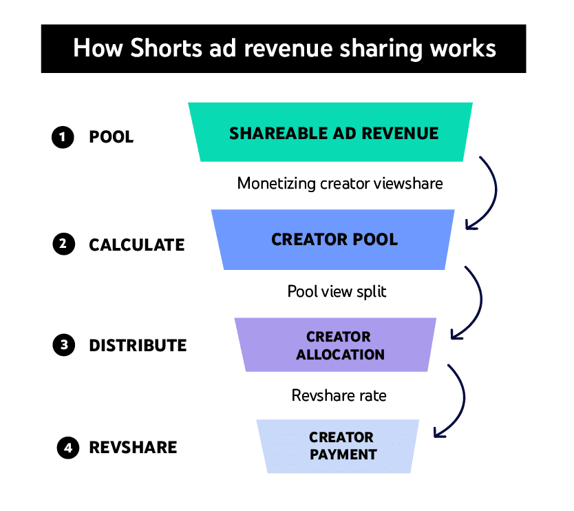
Image source: Google
This works for both short videos and regular YouTube content, making it safer for creators who want steady income.
#2 -  TikTok Ban Rumors/Reality
Rumors (and a quick reality) of a TikTok ban in the U.S. made many creators start posting on YouTube Shorts just in case. YouTube even let Shorts videos be 3 minutes long starting October 2024, copying TikTok’s style while giving creators more flexibility.
YouTube’s Big Advantages
#3 -  Built-in audience
Shorts get boosted by YouTube’s recommendations and trending lists, helping creators grow faster. TikTok doesn’t connect as well to other apps or longer videos.
#4 -  Different viewers
YouTube’s users are often older (25-34) vs. TikTok’s teen-heavy crowd, so creators can reach new fans.
#5 -  Creators Are Fed Up With TikTok
Many say TikTok’s rules change too often, and they’re tired of worrying about bans. YouTube feels more stable, especially with Google’s support for targeting the right audiences. The 3-minute Shorts also let them tell better stories without switching apps.
...And critically, most DTC & Direct Response advertisers are still under-leveraging YouTube Shorts as an ad placement.
(and the upside is huge)
So, what are some ways you can succeed with YouTube Shorts ads?
Let’s take a closer look at 2 YouTube Shorts ads doing well right now:
 Ad 1: Muscle Booster (Chair Tai Chi for men over 60)
The first ad opens with an animated older man, shirtless, seated in a plain grey chair against a soft, brush-painted background. No gym, no real footage, nothing that looks remotely like stock fitness content. A calm, first-person voiceover starts talking before you've even registered what you're looking at:
"Begin each morning with this secret chair Tai Chi program focused on enhancing muscle tone for men over 60."

The animation cuts through a sequence of seated exercises:
twists, presses, leg lifts, each one labeled with a rep scheme (2x15, 3x10) stamped in red across the corner of the frame, the way a workout app would tag a set.
Then the voiceover shifts from instructional to personal: "I wanted to stay strong and keep my muscles active, but traditional workouts felt too hard on my body." A friend suggested an app. He tried the program. And then the ad does something most fitness ads skip entirely - it walks through a real timeline.
One week: muscles feel more engaged.
Two weeks: balance and core got stronger.
One month: moving with confidence and strength again.
The close is almost aggressively simple: "All I had to do was open the app and follow along."
Why this ad works:
 The objection is named before the product is. "Traditional workouts felt too hard on my body" isn't a throwaway line - it's the single biggest reason this exact audience hasn't started exercising in years. Most fitness ads assume the viewer just needs motivation. This one assumes the viewer has already tried and gotten hurt, or is afraid they will. Naming that fear in the first ten seconds does more conversion work than any transformation photo could.
 Animation removes every reason to disbelieve the visuals. A real 60-year-old man doing chair exercises on camera would invite scrutiny - is he really 60, is that really his body, is this staged. A rendered character sidesteps all of it. Nobody's fact-checking a cartoon. That frees the ad to spend its full runtime on the emotional arc instead of defending its own footage.
 The voiceover is a testimonial with zero production cost. There's no actor to cast, no release form, no risk of the "customer" looking unconvincing on camera. The entire trust transfer happens through the script alone - "I wanted... I tried... my muscles felt..." - proving that testimonial-style persuasion doesn't require a testimonial-style production.
 The week-by-week ladder gives the viewer a calendar, not a promise. "After one week... two weeks in... after a month..." is deliberately unspecific about numbers, but very specific about time. That's the right trade for this audience - they're not shopping for a clinical stat, they're shopping for proof that change happens on a realistic human timeline, not overnight.
 "For men over 60" works as a qualifier, repeated on purpose. Said twice in the first fifteen seconds, it isn't just describing the product - it's actively filtering the audience. Everyone outside the demographic scrolls past without a second thought; everyone inside it feels like the ad was cut specifically for them.
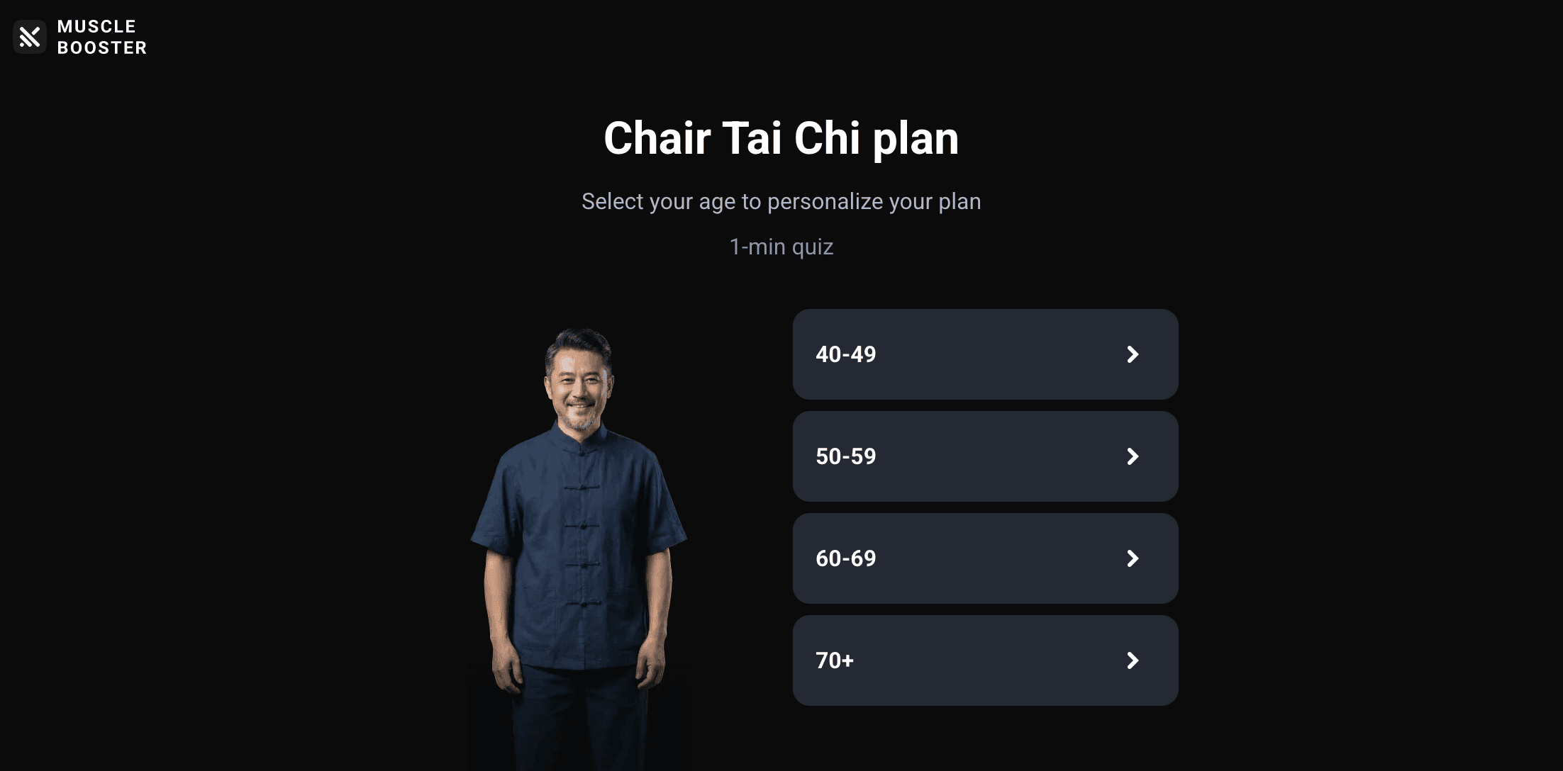
Here’s a quick look at this advertiser’s quiz-type landing page in use:
 Ad 2: Hungryroot (The A1C number that sells itself)
The next ad opens mid-action: a woman's hands cradling a bowl of roasted vegetables, sunlight behind her, before a single red caption appears over the food -
"My A1C dropped from 6.9 to 5.5"

And only then does the voiceover start talking. No brand name yet. No product shot. Just a number, and the implicit promise that everything that follows will explain how she got there. She continues, spoon in hand, eating yogurt at her kitchen counter: "and I've reduced my meds, all because Hungryroot makes healthy eating so simple." From there the ad moves fast through proof beats - a countertop covered in labeled groceries, a delivery box on a doorstep stamped "If you're on GLP-1s", the same box again with " or looking to support your body naturally," hands unpacking produce and pantry items, a bowl being assembled with tzatziki and rice, a packed lunch container of clean-cut vegetables. The close ties it together without ever raising its voice: "Whether you're on medication or managing it naturally, Hungryroot meets you where you are."
Why this ad works:
 The hook is a number, not an adjective. Most food and wellness ads open with a feeling - "I feel amazing," "I have so much energy." This one opens with a specific, verifiable-sounding lab result. 6.9 to 5.5 is harder to wave away as marketing fluff than "I feel better," and for a health-anxious audience, that specificity builds credibility in the first two seconds, before the brand name has even appeared.
 "If you're on GLP-1s - or looking to support your body naturally" widens the net in one breath. This single line does the job of two separate ads. It speaks with real precision to a fast-growing, high-intent audience (GLP-1 users managing side effects and nutrition), while simultaneously reassuring everyone else watching that they aren't being excluded. Nobody feels like the ad wasn't meant for them.
 "Like seeing a dietitian without the hoops or the cost" reframes the entire value proposition. This isn't sold as a meal kit competing against other meal kits - it's positioned against the far more expensive and inconvenient alternative of professional nutrition counseling. That comparison makes whatever Hungryroot costs feel small, without the ad ever having to state a price or defend it.
 The visual proof stacks quietly, without narration. The unboxing, the labeled groceries laid out on the counter, the neatly packed lunch container - none of it is explicitly called out as "proof" in the voiceover. It doesn't need to be. It's doing constant, low-key reinforcement that this is a real, repeatable weekly routine, not a single cherry-picked delivery staged for the camera.
 "My doctor has too" is borrowed authority without a clinical claim. The ad never says a doctor endorses the product or that it treats a condition - it simply says her doctor has also seen the results. That's a meaningful legal and trust distinction: it transfers credibility from a medical professional without making Hungryroot responsible for a medical claim.
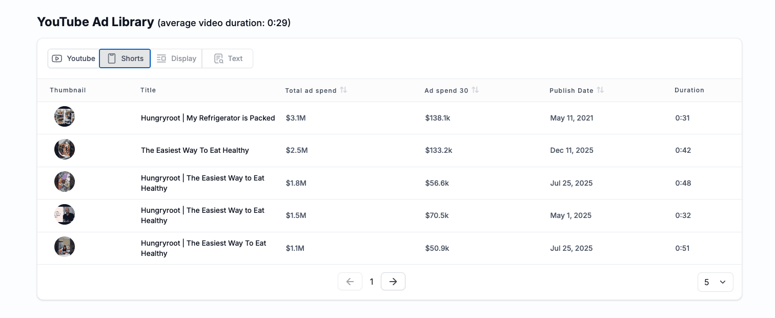
This advertiser has many other big-spending cool ads to model after, don’t forget to check them out inside VidTao as well for some additional inspo!
Here’s a sneak peek:
 Confession: these breakdowns take us hours.
The hook, the angle, the proof, the CTA - we pull each ad apart by hand, three ads at a time, plus all the media. So here's a secret: we've been teaching VidTao to do this automatically. Every scaling ad in the library, broken down the way we just did - the hook type and its exact opening words, the pain points it presses, the proof it leans on (demo? testimonial? before/after?), who's presenting (founder? expert? UGC?), the CTA and the offer behind it, right down to funnel stage.
 It's coming in VidTao 3.0. If you like these emails, you're going to love it. Stay tuned.

VidTao 3.0 preview
That's all for this week!
We hope this week’s selection of high-performing YouTube Shorts ads has sparked new ideas to test yourself!
Want more insights like these?
Stay tuned for next week’s VidTao 2 Shorts Tuesday…
…where we’ll continue breaking down winning YouTube Shorts Ads you can break down + model for your own creatives & campaigns.