

Want to see some YouTube Shorts ads that are scaling right now, using VidTao ad spy tool?
You’re in luck…
Because today is 2 Shorts Tuesday. Why YouTube Shorts ads?
Because YouTube Shorts ad inventory is only going to keep growing:
5 Reasons Why More Creators Are Choosing YouTube Shorts Instead of TikTok
#1 -  MORE MONEY
YouTube made it easier to earn money with YouTube Shorts in 2024 by letting creators take a cut of ad money from their Shorts—a better deal than TikTok’s confusing payment system.
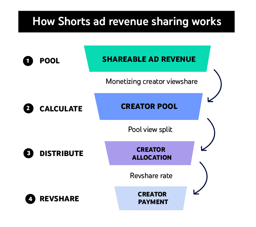
Image source: Google
This works for both short videos and regular YouTube content, making it safer for creators who want steady income.
#2 -  TikTok Ban Rumors/Reality
Rumors (and a quick reality) of a TikTok ban in the U.S. made many creators start posting on YouTube Shorts just in case. YouTube even let Shorts videos be 3 minutes long starting October 2024, copying TikTok’s style while giving creators more flexibility.
YouTube’s Big Advantages
#3 -  Built-in audience
Shorts get boosted by YouTube’s recommendations and trending lists, helping creators grow faster. TikTok doesn’t connect as well to other apps or longer videos.
#4 -  Different viewers
YouTube’s users are often older (25-34) vs. TikTok’s teen-heavy crowd, so creators can reach new fans.
#5 -  Creators Are Fed Up With TikTok
Many say TikTok’s rules change too often, and they’re tired of worrying about bans. YouTube feels more stable, especially with Google’s support for targeting the right audiences. The 3-minute Shorts also let them tell better stories without switching apps.
...And critically, most DTC & Direct Response advertisers are still under-leveraging YouTube Shorts as an ad placement.
(and the upside is huge)
So, what are some ways you can succeed with YouTube Shorts ads?
Let’s take a closer look at 2 YouTube Shorts ads doing well right now:
 Ad 1: Black Forest ad (High flavanol cocoa "vein-popping" demo)
Let’s watch our first ad pick for this week:

The ad opens on bare skin, flat and unremarkable, as a man's voice narrates what the viewer is supposed to notice by its absence: "You can see there's no vasodilation going on, no veins, no blood pumping."
He scoops a serving of dark powder into frame — his high flavanol cocoa — and explains the mechanism in plain terms: it promotes nitric oxide, and nitric oxide is what opens up blood vessels to allow more blood flow. Then he sets up the actual demo: he's about to go work out, and he'll show what his body looks like before he starts.
The ad cuts forward in time — thirty to forty-five minutes later — and the same arm is now visibly different: veins raised, forearm vascular, the exact change he predicted, filmed in what reads as one continuous personal log rather than a produced before/after. He adds, almost as an aside, that it "works down there on the main one" too, and that he can see it in his legs.
After finishing his workout, he pivots from aesthetics to health, citing a Harvard doctor's study claiming high flavanol organic cocoa can double the body's own stem cell production, redirecting those cells to the heart, kidney, and liver. He closes by noting the brand — Black Forest — is running a two-pack bundle sale he's never seen before, and that he's going to hurry and order more, "just like you."
Why this ad works:
 The "before" is defined by absence, which makes the "after" undeniable. Opening on "no vasodilation, no veins, no blood pumping" sets a clear, visually checkable baseline. There's no ambiguity about what changed, because the ad told you exactly what to look for before it happened — so when the veins do appear thirty minutes later, the viewer isn't being told to believe it, they're confirming a prediction they already heard.
 The specific, narrow time window (30–45 minutes) turns a vague supplement claim into something that feels almost like a lab result. Most supplement ads speak in weeks or "over time." Naming a tight window creates urgency and testability — a viewer could, in theory, replicate this exact timeline themselves, which makes the claim feel far more concrete than most category ads bother to be.
 The filming style — handheld, mirror selfie, gym locker room — borrows every visual signal of an unscripted personal log, not an ad. No professional lighting, no studio, no scripted delivery. This matters enormously in the fitness/supplement category, where the audience is trained to distrust anything that looks too polished. The rawness is doing real credibility work.
 The mid-ad pivot from aesthetics to a cited study reframes the entire pitch just as skepticism would normally peak. After a minute of vein-popping visuals, a viewer's guard is up — "this is just a vanity supplement." Naming a specific doctor and a specific claimed outcome (doubled stem cell production, redirected to the heart, kidney, liver) shifts the product from cosmetic to medical-adjacent in a single sentence, right before the offer.
 "I'm going to have to hurry and order some too, just like you" quietly assumes the sale. This isn't a call to action in the imperative sense — it doesn't tell the viewer what to do. It describes the viewer as already having decided, which is a subtler and often more effective persuasion move than a direct instruction.
Creative beats to swipe:
- Open by explicitly naming what's absent in the "before" state, so the viewer knows exactly what to watch for when the "after" arrives.
- Use a narrow, specific time window for your results claim rather than a vague "over time" — specificity reads as testable, and testable reads as honest.
- Shoot in a deliberately unpolished, personal-log style when your audience is primed to distrust slick production — the rawness itself becomes a trust signal.
- Mid-ad, pivot from the surface-level benefit (aesthetics, vanity) to a deeper, more credible one (health, medical research) right as viewer skepticism would naturally peak.
- Close with language that assumes the purchase decision has already been made, rather than issuing a direct command.
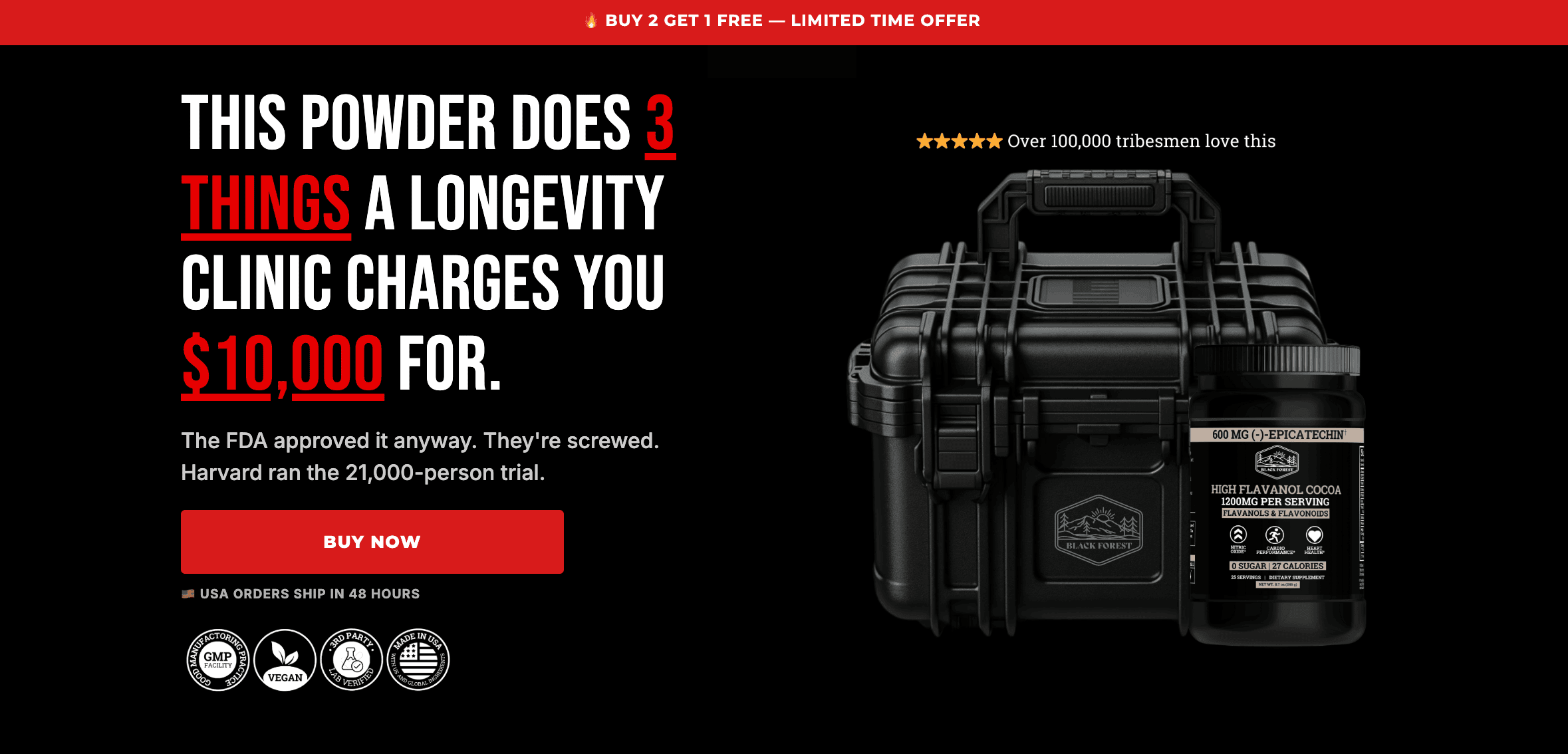
Finally, let’s take a quick look at their landing page in use:
 Ad 2: RiseGuide (The elevator first impression ad)
Let’s now see our second ad pick:

The ad opens on a bold on-screen claim before any scene has been set: "Never, I mean never, introduce yourself by saying your name. If your name is the first thing out of your mouth, you already lost your first impression."
A second line follows immediately, tying the claim to social proof of a very specific kind — "Wealthy families have known these first impression secrets for generations. Now it's finally public." The ad then cuts into what plays like a scripted vignette: a woman in an elevator rehearsing her introduction — "Hi, my name is Sarah, nice to meet you" — trying variation after variation, each one immediately critiqued by an off-screen voice.
One version gets cut off mid-sentence. Another draws a sharp correction — "Never, and I mean never, ask that." The exchange escalates into a small, pointed argument about politeness itself: "The nicer you are, the faster you lose respect." The scene resolves with a directive — disappear for a month, come back a well-spoken person — before the ad shifts fully into direct address: a woman on a conference stage lists three specific phrases that make you sound less well-spoken, strikes two of them through on screen, and pivots into the core testimonial.
She's 47, not 20 anymore, and does nine minutes of articulation training a day. Her thoughts come out clean now. Her boss asks her for advice. The ad closes with a staged curriculum shown on screen — fifteen titled lessons, each with a runtime — before a direct final ask: tap the link and start today.
Why this ad works:
 The opening claim is a taboo, not a tip. "Never introduce yourself by saying your name" contradicts something almost everyone does automatically and has never questioned. That contradiction is what stops the scroll — it's not advice being offered, it's a rule being broken that the viewer didn't know existed.
- "Wealthy families have known this for generations" borrows the specific mystique of inherited social knowledge, not generic expertise. This isn't framed as a communication coach's opinion — it's framed as a class-based secret that's finally leaking out. That specific type of authority (old money knows something you don't) taps into aspiration and exclusion simultaneously, which is a stronger pull than "experts recommend."
 The elevator scene dramatizes failure in real time instead of just describing it. Watching someone visibly struggle to land an introduction — interrupted, corrected, over-explaining — lets the viewer recognize the discomfort of their own past attempts without being told "you've probably done this too." The recognition happens through watching, not through being addressed.
 The "nicer you are, the faster you lose respect" line reframes a virtue (politeness) as a liability. This is a genuinely uncomfortable claim, and that discomfort is the point — it forces a small moment of self-examination in viewers who pride themselves on being polite and agreeable, which is exactly the audience this product is trying to reach.
 The visible curriculum at the close is a specificity play, same as it's proven to be in this category before. Fifteen named lessons with runtimes read as a real, built product rather than a vague promise — "Give Tough Feedback Fast — 17 min" is a far more convincing signal of substance than any adjective the ad could use to describe itself.
Creative beats to swipe:
- Open with a rule that contradicts common, unquestioned behavior — a taboo lands harder than a tip.
- Attach your authority claim to a specific, aspirational, slightly exclusive source (old money, elite insiders, a named industry) rather than generic expertise.
- Dramatize the failure state as a short scene the viewer watches happen to someone else, rather than describing the problem directly to camera.
- Find one comfortable, well-regarded trait your audience prides itself on and reframe it as secretly working against them — discomfort creates stickiness.
- Close by showing your actual curriculum or content list on screen, with specific titles and runtimes, to prove depth rather than just claim it.
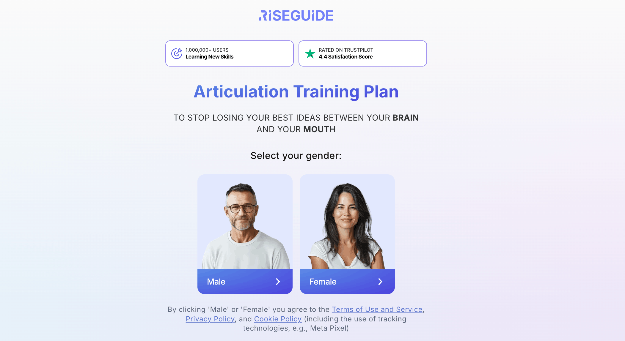
To finish off with, here’s what their quiz-type landing page in use looks like:
P.S If you wanna see more ads by RiseGuide, check them out inside VidTao.
 VidTao 3.0 brings you AI-enriched ad search — find your next idea in seconds!
We analyze the first minute of every scaling ad — the visuals and the audio — and break it down across a dozen dimensions: the hook , the angle, the production style, the visual elements, the spokesperson, the CTA and offer, the audio, the accurate format, and the ad's strategy.
These become:
- A search filter— narrow the library to the exact hook, funnel type, or format you want, instead of endless scrolling.
- A benchmark— a breakdown of what the top-spending advertisers are doing, viewable by your niche, the competitors you follow, or your own google ad account.
 It's coming in VidTao 3.0. If you like these emails, you're going to love it. Stay tuned.

VidTao 3.0 preview
That's all for this week!
We hope this week’s selection of high-performing YouTube Shorts ads has sparked new ideas to test yourself!
Want more insights like these?
Stay tuned for next week’s VidTao 2 Shorts Tuesday…
…where we’ll continue breaking down winning YouTube Shorts Ads you can break down + model for your own creatives & campaigns.