

Want to see some YouTube Shorts ads that are scaling right now, using VidTao ad spy tool?
You’re in luck…
Because today is 2 Shorts Tuesday. Why YouTube Shorts ads?
Because YouTube Shorts ad inventory is only going to keep growing:
5 Reasons Why More Creators Are Choosing YouTube Shorts Instead of TikTok
#1 -  MORE MONEY
YouTube made it easier to earn money with YouTube Shorts in 2024 by letting creators take a cut of ad money from their Shorts—a better deal than TikTok’s confusing payment system.
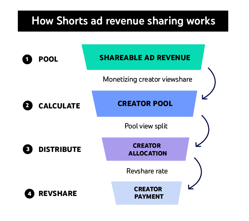
Image source: Google
This works for both short videos and regular YouTube content, making it safer for creators who want steady income.
#2 -  TikTok Ban Rumors/Reality
Rumors (and a quick reality) of a TikTok ban in the U.S. made many creators start posting on YouTube Shorts just in case. YouTube even let Shorts videos be 3 minutes long starting October 2024, copying TikTok’s style while giving creators more flexibility.
YouTube’s Big Advantages
#3 -  Built-in audience
Shorts get boosted by YouTube’s recommendations and trending lists, helping creators grow faster. TikTok doesn’t connect as well to other apps or longer videos.
#4 -  Different viewers
YouTube’s users are often older (25-34) vs. TikTok’s teen-heavy crowd, so creators can reach new fans.
#5 -  Creators Are Fed Up With TikTok
Many say TikTok’s rules change too often, and they’re tired of worrying about bans. YouTube feels more stable, especially with Google’s support for targeting the right audiences. The 3-minute Shorts also let them tell better stories without switching apps.
...And critically, most DTC & Direct Response advertisers are still under-leveraging YouTube Shorts as an ad placement.
(and the upside is huge)
So, what are some ways you can succeed with YouTube Shorts ads?
Let’s take a closer look at 2 YouTube Shorts ads doing well right now:
 Ad 1 — Pop-on Veneers (The at-home smile lab)
Our first ad pick for this week opens fast and loud: a rapid montage of different people — different ages, different settings, all filmed candidly at home — popping in a set of veneers, each one landing on the same satisfying "pop" sound effect. Before any explanation, the voiceover states the thesis outright:
"Pop On Veneers is the best and easiest way to get the smile you deserve."

From there it slows down into a clear, procedural walkthrough. You'll receive an impression kit. The kit has everything you need to make teeth molds at home. Once you've made your impressions, you ship them to the Pop On lab in New York City using a prepaid label already attached to the box. A staff member's voice takes over — "Come on in. I'll show you how your smile's made." — and the ad shifts into an inside-the-lab sequence: a real designer at a computer, a 3D scan of a set of teeth rotating on screen, gaps and chips and missing teeth highlighted and corrected digitally. The close returns to the emotional register of the opening: veneers shipped home in your chosen color, a box of extras waiting for you, and a line that reframes the whole purchase as identity rather than a transaction — "Welcome to the Pop On family."
Why this ad works:
 The multi-person "pop" montage is the hook, and it's built entirely from user-generated footage. Instead of one polished spokesperson, the ad opens on several different real customers doing the same simple action in their own homes. That repetition across different faces does the job of social proof before a single claim has even been made — the viewer's brain registers "other people are already doing this" before it registers what "this" even is.
 Showing the actual lab, not just the packaging, defuses the biggest objection to any at-home dental product: "can this really work without a dentist?" Most direct-to-consumer dental brands stop at the unboxing. This one goes further, walking the viewer into a real facility with real designers and real 3D modeling software. That transparency directly answers the skepticism a product like this is guaranteed to generate.
 The 3D scan sequence turns an abstract promise ("custom made just for you") into something the viewer can actually see happening. Watching a rotating digital model of teeth being corrected for gaps and chips is far more convincing than a voiceover simply asserting the veneers are personalized — it's proof of a process, not a claim about one.
 The prepaid shipping label detail quietly removes a friction point before the viewer even thinks to ask about it. It's a small, almost throwaway line, but it answers a very practical logistics question (how do I even send this back?) at the exact moment curiosity about the process would otherwise turn into hesitation.
 "Welcome to the Pop On family" reframes what's actually a manufacturing and logistics product as an identity and belonging purchase. By the time this line lands, the viewer has just watched a fairly clinical process — molds, labs, 3D scans — and the ad deliberately pulls the emotional temperature back up at the very end, so the last feeling is warmth, not procedure.
Let’s also take a quick scroll through this advertiser’s landing page in use:

Creative beats to swipe:
- Open on a fast montage of multiple real customers performing the same simple, satisfying action — let repetition across different people do the social proof work before you explain anything.
- State your core promise as a flat, confident sentence in the first three seconds, not a question or a tease.
- Walk the viewer through your actual process, including the parts happening behind the scenes (the lab, the software, the team) — transparency defuses skepticism faster than reassurance does.
- Show technical or manufacturing proof (a 3D scan, a formula, a build process) visually rather than just claiming customization or quality in the voiceover.
- Resolve small logistical frictions (shipping, returns, next steps) in a single throwaway line so they never become a reason to hesitate.
- Close on identity and belonging language, even for a product that's fundamentally transactional — end on warmth, not on the mechanics you just explained.
 Ad 2 — Escentric Molecules × Filth (The artist interprets a scent)
The next ad opens on a woman seated at a plain table, a bottle of amber-colored perfume in front of her, introducing herself plainly and without fanfare:
"I'm Rosie, I'm the creative director at Filth."

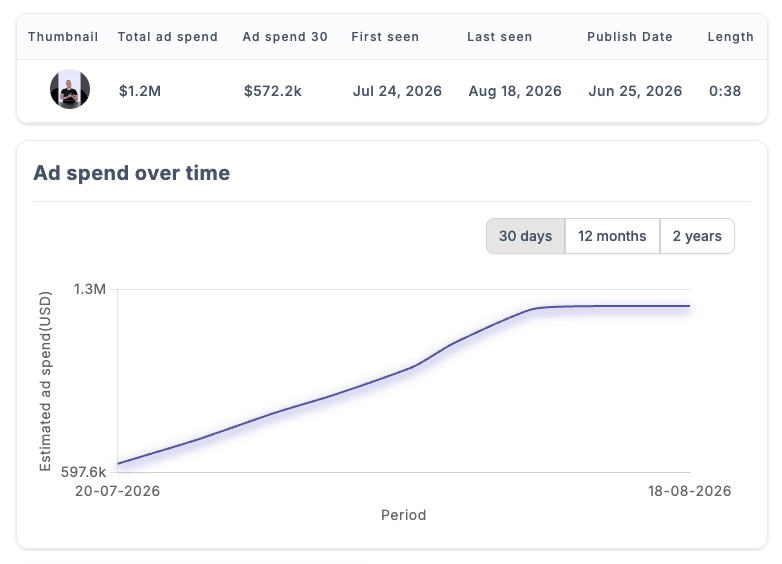
She explains she's at the Escentric Molecules lab, creating a work inspired by a specific fragrance — M+ Clary Sage. The ad then cuts away from her entirely for a stretch, into a wordless sequence of hands building an abstract sculptural piece: tangled wire mesh, a curved copper pipe, a small arrangement of white chrysanthemums, a block of raw concrete. No narration explains what's being built or why — the viewer is simply watching a creative process unfold in real time, set against ambient music. Only when she reappears, spritzing the scent and holding the bottle up to camera, does she put words to the experience: "It's a super clean scent. I really like the sage coming through on it. It's quite like a grounded kind of earthy kind of scent, but it's elevated." She names the actual composition — Molecule 01 combined with Clary Sage, synthetic paired with natural — before delivering the closing verdict, product in hand, next to the finished sculpture: "I think it's very Filth, and I think it's also very Escentric Molecules."
Why this ad works:
 Interpreting a scent through sculpture rather than adjectives solves fragrance advertising's oldest problem: you can't show a smell. Instead of relying entirely on descriptive language, the ad gives the viewer a physical, visual stand-in for an abstract sensory experience. The sculpture becomes a translation device — you may not be able to smell it through the screen, but you can see what it apparently feels like.
 A creative director, not a brand spokesperson, is the one doing the reviewing. Rosie isn't introduced as an influencer or presented as a paid endorsement in the traditional sense — she's framed as a working artist responding to the scent through her own creative practice. That framing borrows the credibility of genuine artistic judgment rather than manufactured enthusiasm.
 The wordless build sequence creates space instead of filling it. Most ads are terrified of silence and pack every second with claims or music-backed narration. This one lets a full stretch of the ad run with no explanation at all — just hands working, materials coming together. That restraint signals confidence: the brand trusts the visual alone to hold attention without constantly justifying itself.
 Naming the actual composition — "Molecule 01 and Clary Sage," synthetic combined with natural — gives fragrance enthusiasts a real technical anchor inside an otherwise abstract, artistic ad. For a niche fragrance audience that cares about notes and composition, this single line does concrete category credibility work underneath all the artistic framing.
 The closing line ties two brand identities together as a single verdict, rather than a one-sided endorsement. "Very Filth… also very Escentric Molecules" positions this as a genuine creative match rather than an ad reading as sponsored content — the scent isn't just being praised, it's being placed inside her own aesthetic world as something that belongs there.
This advertiser also has one of the most beautiful landing pages we came across, here’s a sneak peek:

Creative beats to swipe:
- When your product is hard to depict directly (a scent, a feeling, an intangible quality), build a physical or visual stand-in that translates the experience rather than just describing it in words.
- Cast a credible creative practitioner in your category, not a spokesperson, and let their actual practice do the reviewing.
- Allow a real stretch of wordless, unexplained visual process into the ad — resist the urge to narrate every second.
- Include one concrete, technical detail (an ingredient, a formulation, a specific composition) even inside an otherwise artistic or abstract ad — it anchors credibility for the audience who cares about specifics.
- Close with a two-way verdict that positions the product as belonging inside the creator's own identity, rather than a simple one-directional endorsement.
 VidTao 3.0 brings you AI-enriched ad search — find your next idea in seconds!
We analyze the first minute of every scaling ad — the visuals and the audio — and break it down across a dozen dimensions: the hook , the angle, the production style, the visual elements, the spokesperson, the CTA and offer, the audio, the accurate format, and the ad's strategy.
These become:
- A search filter— narrow the library to the exact hook, funnel type, or format you want, instead of endless scrolling.
- A benchmark— a breakdown of what the top-spending advertisers are doing, viewable by your niche, the competitors you follow, or your own google ad account.
 It's coming in VidTao 3.0. If you like these emails, you're going to love it. Stay tuned.

VidTao 3.0 preview
That's all for this week!
We hope this week’s selection of high-performing YouTube Shorts ads has sparked new ideas to test yourself!
Want more insights like these?
Stay tuned for next week’s VidTao 2 Shorts Tuesday…
…where we’ll continue breaking down winning YouTube Shorts Ads you can break down + model for your own creatives & campaigns.